Brand kit
The Gaffbee look
One warm, calm identity: a plum base, honeyed coral accents and a friendly rounded display face. Everything below is a live token from the product, not a mockup.
Logo
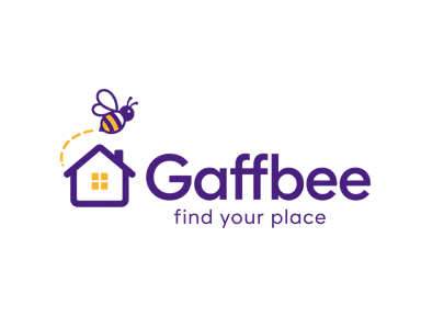
Bee-and-home lockup. Keep clear space equal to the height of the mark, never recolour or redraw it, and use the transparent lockup on tinted backgrounds.
Colour
Plum (primary)
var(--primary)Buttons, links, brand headings
Coral (accent)
var(--accent)Highlights, success states, dots
Ink (foreground)
var(--foreground)Body copy and display type
Canvas (background)
var(--background)Page background
Card
var(--card)Panels, glass surfaces
Muted
var(--muted)Secondary copy, chips
Typography
Display — Nunito, black weight
A calmer way to find your place.
Body — Nunito Sans
Plain-English copy, short sentences, no jargon. Sentence case everywhere except small eyebrow labels, which are uppercase with wide tracking.
Hero styling
- Honeycomb pattern at 6–8% opacity, top-right and bottom-left.
- Plum radial glow at the top, coral glow at the bottom.
- Gradient text (plum → coral) on the final phrase of the headline only.
- Primary action on a soft glass panel:
bg-card/70+ backdrop blur + deep plum shadow. - Corner radius: 12px inputs, 24px panels. Motion stays under 500ms.